
The Wall, the Lasagna, and the Last Biologist Who Codes
Published:
The Wall, the Lasagna, and the Last Biologist Who Codes
I just got back from the LS2 Swiss Proteomics meeting in Bern. Lovely city. Good science. And I couldn’t stop doing what scientists apparently do when they’re trapped in a room full of other scientists: I counted things.
My census: roughly 100 attendees. Of those, I’d estimate 75 could open a terminal and write working R code without googling the syntax. Maybe 5 could tell you what a memory allocation is. I’ll come back to this ratio at the end. It matters more than it seems.
But first: the science.
The Wall Everybody Knows About But Nobody Talks About
There is a thing happening in proteomics, and in systems biology more broadly, that the field has not fully admitted to itself. Data generation has lapped data analysis. Not slightly. Substantially.
We now routinely co-profile transcriptomes, proteomes, metabolomes, and lipidomes from the same biological samples. A single experiment produces more features than any human can usefully stare at. The field’s response, for the most part, has been to analyze each layer separately, write it up independently, and then in the discussion section gesture vaguely toward “concordant findings across omics layers.”
Different omics layers have different statistical properties, different noise structures, different feature counts. Protein intensities are not metabolite abundances. What you actually need is a method that respects the individuality of each data layer while still letting them talk to each other. Not “which genes co-vary?” but “which proteins, metabolites, lipids, and phenotypes form coordinated programs across biological layers?” Those are different questions and they have different answers.
This is what we have been building.
WGCNA, Generalized
WGCNA seemed less familiar in that room than I expected. Weighted Gene Co-expression Network Analysis, around since 2005, cited somewhere in the thousands, does one thing very well: it takes a feature expression matrix and finds groups of co-varying features, called modules.
Our observation was straightforward. The sample space is shared across all omics layers, because all layers were measured from the same specimens. Correlating eigengenes across layers is the correct mathematical operation for asking whether two biological processes, one from the proteomics layer and one from the metabolomics layer, are responding in concert.
WGCNA+ runs independent WGCNA analyses on each data layer. Each layer gets its own network construction, its own soft-thresholding, its own module structure. This is important: you do not force the layers to share parameters they do not share. Once each layer has its modules, you compare them via their eigengenes in the shared sample space.
The result: ten thousand features become fifty modules. Fifty modules get a map of how they relate to each other and to the outcomes you care about. That is manageable. That is something a scientist can reason about.
And this is where interpretation becomes the real bottleneck. Building modules is one problem. Making biological sense of them at speed is the harder one.
The Lasagna
We have a visualization. We call it the Lasagna. LASAGNA stands officially for Layered Approach to Simultaneous Analysis of Genomic and Network Associations, but let me be honest: we named it the lasagna first and the acronym came later. It is a multi-partite graph where each omics layer is a horizontal stratum, modules are nodes, edges between strata are the cross-layer eigengene correlations, and node size encodes phenotypic relevance.
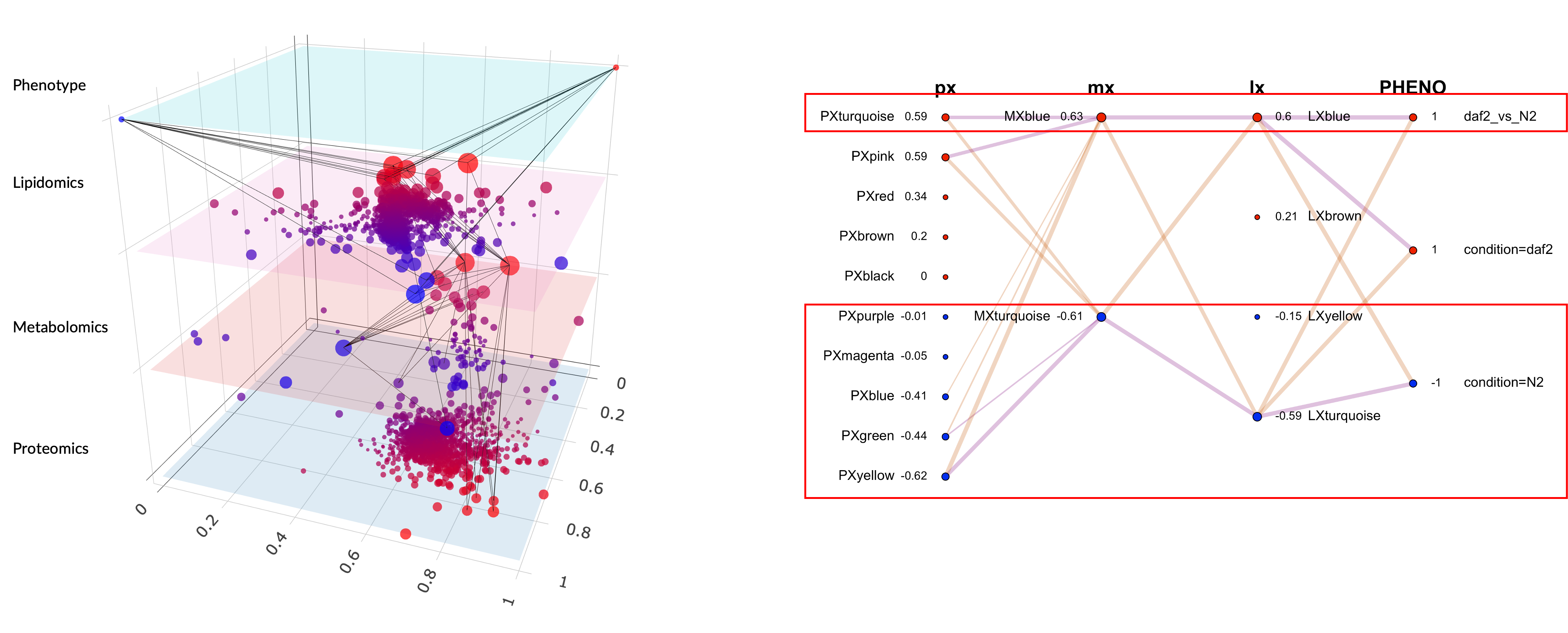
Figure 1. LASAGNA graph for the daf-2 vs N2 multi-omics comparison. Each layer is a horizontal stratum, nodes are modules scaled by phenotypic relevance, and edges encode cross-layer eigengene correlations.
Here is what it actually shows. In the C. elegans dataset I presented in Bern, a comparison of the daf-2 longevity mutant against wildtype N2, each dot is a module, each color belongs to a layer, and the connections tell you which protein modules co-vary with which metabolite modules. The red dots are the modules driving the phenotypic difference.
Before the narrative layer, the readout is mostly module colors plus correlations. On one hand, the proteomics layer is dominated by PxTurquoise and PxPink on the daf-2 side, and those protein modules correlate with a metabolomics module (MxBlue) and a lipidomics module (LxBlue). That already gives you a cross-layer signal: independent layers moving together in the same contrast direction. On the other hand, the N2 side shows a different configuration, with proteomics modules Yellow and Green correlating with metabolomics and lipidomics Turquoise modules. The graph shows two coordinated programs across the proteome, metabolome, and lipidome of C. elegans.
When people see this for the first time, the first question is always some version of “what are all those colors?” Fair question.
This was always the hard part of WGCNA. Building the modules is computationally demanding but conceptually simple. Making sense of them required digging module by module, feature by feature, and gene set by gene set, trying to extract a biological story by sheer willpower. Some people are very good at this. All of them are slow.
What the LLM Actually Does Here
After module detection and enrichment analysis, we pass structured outputs to the language model and generate an AI-assisted report and infographic. The logic is the same as a scatter plot versus a table of numbers: patterns become visible faster. The model receives top features ranked by module membership and trait significance, enriched gene sets, and correlated phenotypes, then turns that into a biological narrative.
Here is what the LLM found in our dataset with the structured context that we provided it. The daf-2 side is not just a cluster of colors. On one side, the proteomics Turquoise module resolves into antioxidant activity while the metabolomics Blue resolves into metabolic salvage and osmolyte handling and the lipidomics Blue resolves into phospholipid remodeling. On the other side, N2 is not just a different arrangement of modules. PxYellow resolves into ribosome and translation machinery. PxGreen resolves into reproduction and yolk assembly. MxTurquoise resolves into anabolic growth substrates. LxTurquoise resolves into structural membrane biogenesis. In a system like daf-2, where the biology is already reasonably well characterized, that is the right kind of payoff: the colors stop being an indexing scheme and start becoming a coherent biological contrast. We can see this also in the infographic:
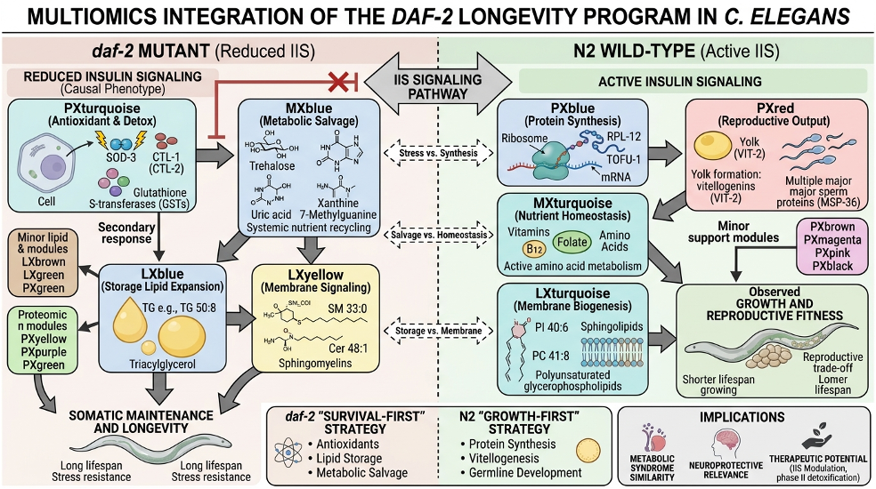
Figure 2. LLM-generated infographic summarising the cross-omics biological narrative for the daf-2 contrast.
The model is synthesizing structured input into a narrative, which is what LLMs are genuinely good at. The biology comes from the enrichment analysis and the module membership statistics. The LLM is the translator, not the expert. In this daf-2 setup, which is relatively well characterized, the themes from the LLM align with the broader literature, which is a positive confirmation of our approach.
For the seventy-five people who can run R but do not want to spend three days manually reading module tables, this translation layer is where time gets returned to science.
What’s Coming Next
I cannot say much here because the work is not finished and I do not want to promise things that haven’t shipped. The logical extension of “write a narrative” is “push back on that narrative”: an agent that not only summarizes your modules but can also answer follow-up questions, reformulate analyses, and help you interrogate what you found.
Concretely, that means workflows like this: ask why module A and module B disagree across phenotypes, request the top conflicting features, rerun the comparison under stricter thresholds, then get a revised narrative plus a visual diff. Same data, tighter loop, fewer manual detours.
The widespread adoption of AI assistants has made conversational interfaces feel natural to people in a way that would have seemed odd five years ago. It turns out that “tell me what is interesting about my proteomics data” is a completely reasonable thing for a biologist to type into a tool. We are building the tool that can handle it. More news when there is something to show.
The Last Biologist Who Codes
Back to my census. Seventy-five people who write R. Five who write C.
The biologists who learned R did not do it because they loved programming. They did it because programming was the toll booth between them and their data. They paid the toll. They understood loops and vectors and data frames well enough to answer their biological questions. A few of them actually came to enjoy it. Most tolerated it.
Here is my prediction, stated plainly: in five years at the same conference, there will be five people who write code and ninety-five who do agent-paired analysis. The five coders will be exceptional, the kind of people who can build the high-performance, high-quality R package that everyone else uses. The ninety-five will do better science than today’s seventy-five, because they will spend their time on biology instead of syntax.
The coding tax is being lifted. This is good news for biology.
Maybe I’m wrong. Maybe a targeted meteor shower takes out every data center in the same afternoon. Short of that, the trajectory is pretty clear. Data analysis is becoming a conversation, and it turns out biologists, who have been having conversations about their data for decades, are well-prepared for this.
The for loop was never the point. It was always the biology.