
Making plotly labels behave: the story behind plotly.repel
Published:
Making plotly labels behave: the story behind plotly.repel
Today I am publishing plotly.repel, an R package that brings ggrepel-style label repulsion to interactive plotly charts.
If you have ever tried to annotate an interactive volcano plot, you know the moment you label more than a few points, everything overlaps and the plot turns into a block of text. With static ggplot2 charts, we can reach for ggrepel. Plotly users have been asking for an equivalent for a long time (see the plotly.js issue thread here): https://github.com/plotly/plotly.js/issues/4674
I recently joined BigOmics, and we rely heavily on plotly for interactive charts. Interactivity is a big part of how we give users context (hover tooltips, zooming into regions, selecting subsets of genes). But once the information density goes up, labels stop scaling. Manual annotation becomes a chore, and a repel layer becomes a must. The most egregious example we encountered at BigOmics was a UMAP of gene features: dozens of cluster labels stacking on top of each other the second you zoom in (Figure 1).
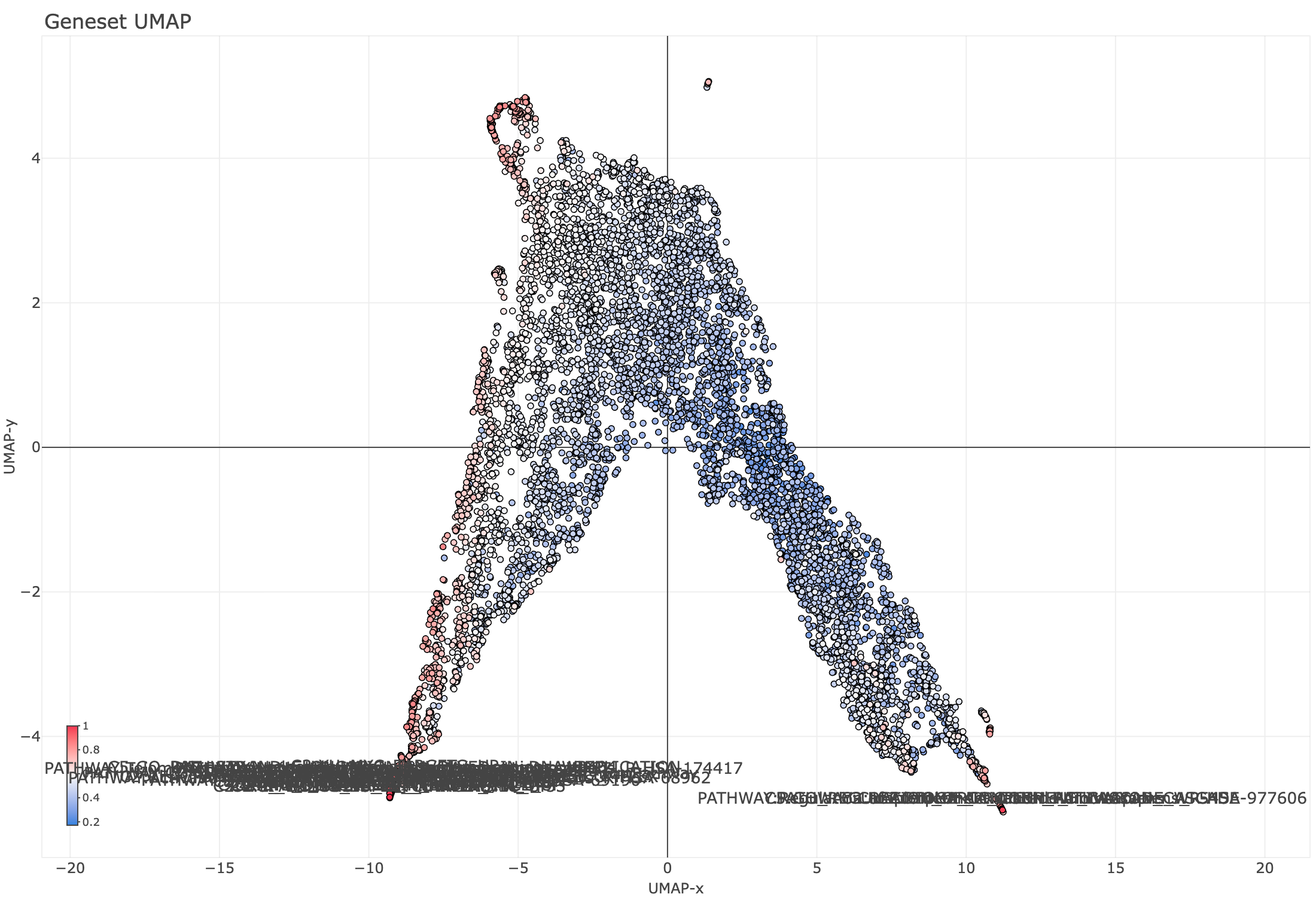
Figure 1. Standard plotly labels on a dense UMAP of gene features: overlapping text makes the plot unreadable at scale.
At the same time, I wanted a contained project to experiment with agentic coding workflows: take a clear spec, turn it into a tested package, and iterate quickly.
The First Instinct: Copy ggrepel
My first instinct was simple: take ggrepel and copy the idea into the plotly world. I cloned the repo, looked through the internals, and quickly realized that most of the hard logic lives in C++.
That was an excellent chance to test whether an agent could help me build an accurate mental model quickly. Since I am fluent in R, I asked for a high-level explanation in pseudo-R (made-up functions, but familiar syntax). I cannot claim it was a perfect reproduction, but it worked for its purpose.
The mental model I came away with: ggrepel is a force-directed solver. Each label is a body under two competing forces: repulsion from neighbouring labels and data points (proportional to 1/d², where d is the distance to a neighbour), and a restoring spring pulling it back toward its anchor point. Think of it as a small physics simulation where every label nudges every other, and the system relaxes toward equilibrium. ggrepel runs up to 10,000 of these iterations, with early passes handling large displacements and later passes fine-tuning positions.
With that base, I treated the expected behavior as a reference, added constraints and specs, and started iterating toward a plotly version. It worked. Then I hit the thing that makes plotly categorically different.
The Reality Check: Interactive Charts Change Under You
ggrepel solves an offline layout problem: the coordinate space is fixed, the plot will not change after render, and the solver can spend as long as it needs to find a good configuration.
Plotly turns that into an online, latency-constrained layout problem: the coordinate space is a function of viewport state. It shifts on every zoom, pan, and resize. The solver cannot run once; it is called continuously, and it has roughly 25 ms per call to feel instant to the user.
In plotly, the user changes the plot:
- zoom in: the coordinate system changes
- pan: the viewport changes
- resize: the pixel geometry changes
- animate: the whole scene changes per frame
This shifted what “good enough” meant. A solver that is perfect once and wrong after zoom is worthless. A solver that is “pretty good” but stable across reruns and fast enough to be transparent to the user is the right goal.
The naive port made this painfully concrete: at 50 labels on a volcano plot, the solver ran in 162 ms per call. On every zoom event. Effectively unusable.
The fix came from a direction I would not have reached on my own. Working with a search-and-retrieval agent that pulled in literature on spatial indexing, I landed on approximate nearest-neighbor collision detection, a technique from the world of vector databases and ML search that transfers cleanly to label geometry. Rather than checking every label against every other label on each iteration, the plot space is partitioned into a uniform grid and each label is indexed into a cell. Collision checks then touch only the 9 cells adjacent to a label, turning an operation that scales with the square of the label count into one that is effectively constant.
The result: 1.80 ms per solve at 50 labels. The solver now re-runs on every zoom, pan, and resize without the user noticing.
This is also where “agentic programming” paid off in a way I had not expected. It was not just about writing code faster. It was about having a research layer that could pull ideas from outside my usual reading and apply them to a concrete engineering problem.
What You Get
plotly.repel gives you:
add_text_repel()for repelled text labelsadd_label_repel()for repelled labels with boxes- optional rules like “label only these points” and “when space is tight, keep the most important labels”
- the ability to choose when relabeling happens (for example: on initial render and zoom)
I am deliberately not going into the implementation details here. The goal is to show what you get and how to use it, not to require you to care about the internals.
Figure 2 shows the same UMAP after plotly.repel — labels pushed apart, connected to their points with leader lines, and stable across zoom and pan.
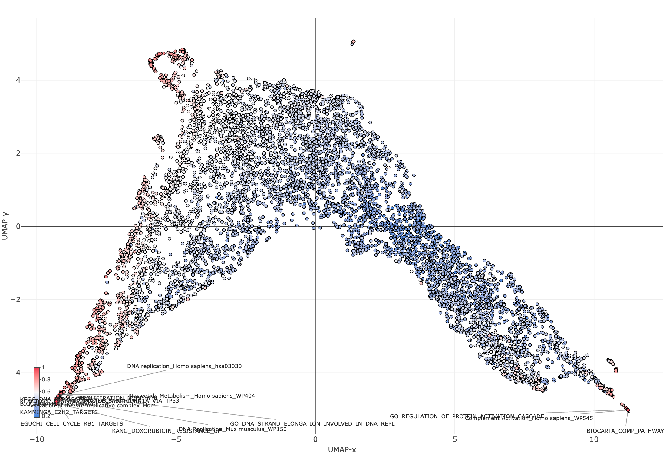
Figure 2. The same plot with plotly.repel: labels are pushed apart and connected to their points with leader lines, remaining legible after zoom and pan.
Install
remotes::install_github("bigomics/plotly.repel")
A Small Example
library(plotly)
library(plotly.repel)

set.seed(1)
df <- data.frame(
  x = rnorm(40),
  y = rnorm(40),
  id = paste0("P", seq_len(40))
)

plot_ly(df, x = ~x, y = ~y) %>%
  add_markers() %>%
  add_text_repel(
    x = ~x, y = ~y, text = ~id,
    # Tuning knobs (start here when you need to tweak behavior):
    force = 1.6,          # repulsion strength (higher = push labels apart more)
    force_pull = 0.8,     # pull back toward the point (higher = stay closer)
    box_padding = 0.35,   # extra space around labels
    point_padding = 0.15, # extra space around points
    direction = "both",   # "both", "x", or "y"
    max_time_ms = 25,     # keep interaction responsive
    seed = 42,            # reproducible initial positions
    on = c("render", "zoom", "resize")
  )
Even in this toy plot, the “feel” matters: labels shouldn’t fight you when you zoom in. If the layout becomes unreadable every time you interact, you stop interacting.
A Pattern I Use Constantly: “Label the Outliers, Not Everything”
The right UX for most scientific plots is:
- show all points
- label only the ones worth discussing
Here is a common pattern where visibility selects which points are eligible for labeling, and priority decides which labels win when space is limited:
set.seed(2)
n <- 1500
df <- data.frame(
  x = rnorm(n),
  y = rnorm(n),
  label = paste0("G", seq_len(n))
)

df$outlier <- with(df, abs(x) > 2.5 | abs(y) > 2.5)

plot_ly(df, x = ~x, y = ~y) %>%
  add_markers(marker = list(size = 6, opacity = 0.5)) %>%
  add_text_repel(
    x = ~x, y = ~y, text = ~label,
    visibility = ~outlier,
    priority = ~(abs(x) + abs(y)),
    max_overlaps = 10,
    force = 1.4,
    force_pull = 1.0,
    box_padding = 0.35,
    point_padding = 0.2,
    max_time_ms = 25,
    seed = 1
  )
What I Learned Building This
Two things I would do the same way again:
- Test driven design: This approach is really powerful with agents. If you have an “source of truth” that the agents can use to check their outputs, you can easily set a feedback loop.
- Using AI for coding is a really powerful tool, but you still need to do what you are doing. Otherwise, the agent will run in circles.
It’s Beta. Please Stress Test It.
If you try plotly.repel, the best feedback is:
- a plot that breaks it
- a plot where it is almost good but not quite
- a screenshot plus a minimal reproducible example
Repository: bigomics/plotly.repel